I’ve been experimenting a bit with black and white and the variations on that spectrum.


Which one do you like best?
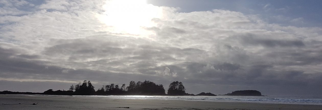
I’ve been experimenting a bit with black and white and the variations on that spectrum.
Which one do you like best?
Comments are closed.

I like the moody skies over the lake best. Good to see some monochrome. I have not been shooting much monochrome or palette lately. Will have to change that as autumn comes. Have a wonderful Saturday Lynette. Allan
LikeLike
Thank you very much, Allan. I think I like the lake shot best as well, followed by the daisies. I think the rose looks too brittle, almost like it’s frozen. Could work for some shots depending on the subject, but not this one. Cheers.
LikeLiked by 1 person
I like it. The black and white pictures give off a totally different vibe. All three captures are nice, but the first is my favourite.
LikeLiked by 1 person
Thank you very much, Linda. The daisies are more sepia-toned, and I like that effect, too. The rose is my least favourite; too sharp, I think.
LikeLiked by 1 person
Right away I thought the daisies were more impressive than the rose in monochrome, but then I scrolled on and saw the lake and that is really impressive.
LikeLiked by 1 person
Thank you very much, Anneli. I think the lake is my favourite, too, followed by the daisies. The rose looks sort of lifeless by comparison. Of course, a lot depends on choosing the right tint for the subject. Cheers.
LikeLiked by 1 person
There isn’t as much natural difference in the depth of colour in a rose, so it’s not as dramatic as with the other pictures. The rose is excellent in colour though.
LikeLiked by 1 person
Yes, they sure are, although I’m still experimenting now and then with monochromatic rose (and other flower) pictures. Cheers.
LikeLiked by 1 person
Really love the play you’ve done with these. The rose has that blue tinge. I liked the lightness of the daisies the best. But the lake’s gray, shadowy clouds made me feel like I was there.
LikeLike
Thank you very much, Lori. 🙂 The rose is my least favourite because I think it’s too brittle, like it might shatter. I find the sepia-toned daisies remind me of my grandmother’s house, maybe because all the pictures of her were tinted that way to lesser or greater degrees. That picture evokes comfort for me. I like the lake photo best; agreed, almost like you’re there. Cheers.
LikeLiked by 1 person
The lake photo for sure….the monochrome adds real atmosphere
LikeLiked by 1 person
Thank you for weighing in. I like the lake photo best as well. I’ve seen it really look like that on stormy days. Cheers.
LikeLiked by 1 person
Some photos really lend themselves to monochrome. I’m partial to the daisies😊
LikeLiked by 1 person
I agree; some monochrome photos can communicate so much more depending on the subject. I like the daisies as well – they remind me of my grandmother’s house. Cheers.
LikeLiked by 1 person
Daisies but I also like the Okanagan Lake…It’s very eerie.
LikeLiked by 1 person
I like how the daisies turned out but the lake photo is much more dramatic and yes, eerie. Cheers.
LikeLiked by 1 person
I liked the daisies right away until I saw the rose. But all three are terrific. The lake shot is something I could stare at. It’s amazing how must more detail you see with a black and white photo – or maybe that’s my imagination!
LikeLiked by 1 person
Thank you very much. 🙂 I agree that black and white communicates differently from colour, especially mood and composition in particular, so I don’t think it’s your imagination at all. Cheers.
LikeLiked by 1 person
I like the rose best…. As an image.
I would try a different toning, though.
LikeLiked by 1 person
Agreed – it definitely needs a different tone. It looks like it’s made out of chalk or some other unappealing substance. Not a good effect. Thanks for your comment. Cheers.
LikeLiked by 1 person